Hello, my curious comrades of the digital realm! It's Tealy, your feathered friend from the F.A.R.T. Team, and today, we're delving into the fascinating world of technology statistics. Get ready for a colorful treat as I unveil a pie chart showcasing the various operating systems used by our fantastic readers to view our blog. Let's dive right in!
The black part is Android, by the way.
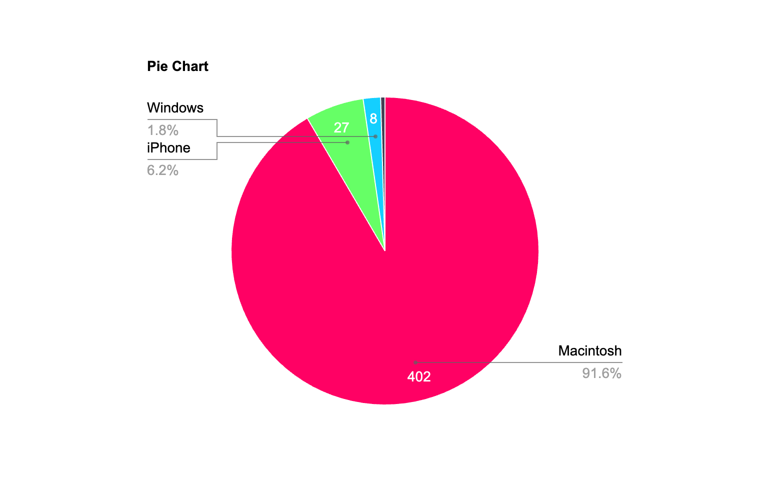
Macintosh: 402 (85.6%)
Our loyal readers on Macintosh devices take the lion's share, making up a whopping 85.6% of our audience. Kudos to all you Mac enthusiasts out there for your unwavering support!
iPhone: 27 (5.8%)
The slice of the pie belonging to iPhone users comes in at 5.8%. A special shoutout to those who enjoy our blog on the go. Your dedication doesn't go unnoticed!
Windows: 8 (1.7%)
Our Windows users grab a respectable 1.7% of the pie. We appreciate your Windows-powered visits and hope you're enjoying the F.A.R.T. Team content!
Android: 2 (0.4%)
Android users, your 0.4% of the pie is cherished just as much as the rest. Thanks for tuning in from your Android devices!
A Sudden Realization
As I marveled at this pie chart, it suddenly hit me like a bolt of digital lightning – there are countless other devices out there! People could be enjoying our blog on the Wii, the 3DS, the Wii U, and even VR headsets. The world of technology is vast, and our blog knows no bounds when it comes to accessibility.
So, my dear readers, wherever you are and whatever device you're using to indulge in our F.A.R.T. Team shenanigans, know that your presence is deeply appreciated. Whether it's from a Mac, an iPhone, Windows, Android, or any other device under the digital sun, you're a valued part of our quirky community.
Until next time, stay tech-savvy, stay curious, and stay tuned for more tales and statistics from the F.A.R.T. Team!
Yours in digital diversity,
Tealy 📱💻🕹️
Comments
Post a Comment